


Open any website nowadays on your phone, tablet, or laptop, and you’ll instantly see an image of some kind. Whether it’s a hero welcoming you to the page, a banner accompanying an article on good customer service, or a social media snap from your favorite influencer, images are an integral part of website design.
Yet, despite their importance, there are still a lot of ways that websites get their image display wrong. So, let’s have a look at some of the common mistakes to avoid when adding images to your website.
1. The bigger picture isn’t always better.
By far the most common trap that websites fall into is not reducing the size of their image files. It’s an easy mistake to make – why wouldn’t you want the best possible image quality you can have?
However, large file sizes mean longer loading times and larger caches, which means less customer retention for your e-commerce website. Recent studies have shown that over 40% of people will quit a website if the loading times are longer than 3 seconds. That’s not long at all, and every millisecond your images take to load will add up.
Reducing the image quality of your JPEG images by a mere 30% can cut the file size in half and, in almost all cases, the drop in quality is so small that it won’t be noticed.
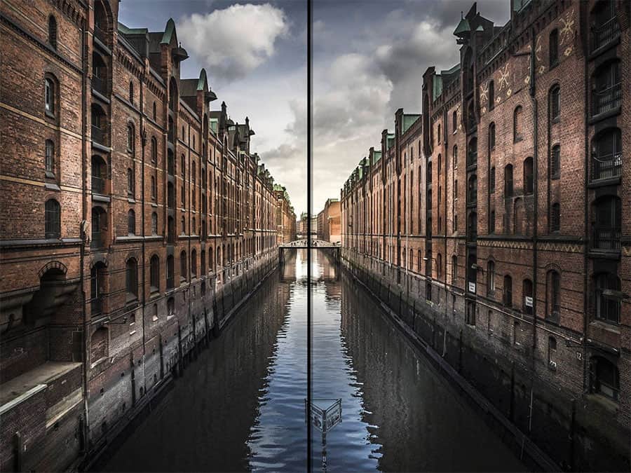
The left-hand side has 70% image quality compared to the right. Notice a difference? Image source.
2. Optimize your look for the web.
After you’ve looked at your file size, chances are your image will be mostly optimized for your website. However, before you upload, you should also consider how well-optimized the file is for the page. Are you uploading to a mostly blank page with text? Or will your image sit in the middle of your project management site with a lot of other images? These factors will change how large a file you want, and consequently how high a quality your image will be.
Considering where your image will go is an important factor in optimizing it fully so that the customer has a seamless experience on your site.
3. Go for those snappy snaps.
You can have the most well-optimized image on your website, but if it’s that same picture of the man holding a coffee cup that appears on every other website, it’s going to look bad. Sure, it’s not the most common way to lose browsers from your site, but it’s an easy fix to help reduce your abandonment rates. Finding those less common images will keep your customers interested in your site and make you stand out in SEO terms.
If you can’t afford a photoshoot to get a unique image, at least run the stock image you’re using through a reverse image search to see how many other websites are using it.
4. Make Favicons your favorite.
It’s easy to overlook icons. They’re such a small part of your website, but an important one nonetheless. This is especially true of the favicon – the small icon that appears on the browser tab of your website.
When a user has 15 tabs open on their browser, being able to navigate back to your website easily is hugely important – especially when they’re in the middle of an interaction. The favicon can easily show which tab contains your website, and can also animate if there’s a change in your site.
Let’s say your customer is mid-conversation with customer support and the chatbot replies. Their tab now shows the page’s title and a notification flashing up. If your customer is not that familiar with this type of service and is wondering, “but what are chatbots and why are they important?”, the favicon will remind them of the site, the notification will alert them to the service, and they will be guided back to the page to use it even if they have clicked away.
Getting the right icons and favicons will help users get back to your website much easier and help them see instant changes to your page.
 It’s becoming easier than ever to switch between devices on the go. Image source.
5. Keep it mobile.
A huge amount of people browse the web on their phones nowadays, meaning your website needs to be optimized for mobile as well as laptop use. And it most likely is – a good website will be built to allow a seamless transition from mobile to laptop so that users switching between the two don’t get lost.
But images are another matter – all too often an otherwise perfect mobile site will have images that are wrongly sized, misplaced, or even badly framed. Whether you’re engaging your users in some effective quiz marketing, or directing them toward your latest service, making sure that the images on your site work well with all devices goes a long way toward creating an impactful website.
6. Something’s cropped up.
You might assume that bad cropping causes the image to be larger, or smaller, or differently shaped to how you want. But usually, that’s not true. That’s what makes this mistake so common and hard to spot.
Let’s say you add an image to your page advertising your effective call monitoring systems. The site defines a block where the image can go; let’s say this block is 600×600 pixels. The image you’ve uploaded is 600×800 pixels. That extra portion of the image doesn’t get cut off, it exists ‘behind’ the image block, unseen for the most part.
However, it still counts towards the pixels to be loaded on your site. So, now you have an extra 120 thousand pixels to load that your customers will never see, all because you haven’t cropped one image. Apply that to the 10 images on your page, and it quickly adds up.
Incorrectly cropping an image can significantly add to your load time, and as we’ve already covered, there can be just a matter of milliseconds between a customer browsing your site and closing the page.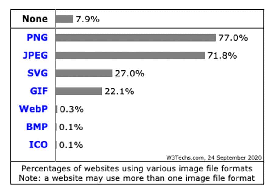
7. What’s your (file) type?
GIFs. PNGs. JPEGs. SVGs. A lot of acronyms for roughly the same thing, right? Knowing which one to use in which case can cut down dramatically on your file size and create more effective images for your customers.
Your digital consumer engagement can also be strengthened through your choice of image file type. So, what’s the best file type to use for you?
GIFs are easy – moving pictures, comprised of multiple frames. More often used for comedic effect (we’ve all sent each other Baby Yoda by now) rather than for advertising purposes.
JPEGs and PNGs – In short, JPEGs have a much smaller file size for the same level of quality, but they don’t work with transparency. So, if you have a basic image, always use JPEG format. If you want to be able to see behind your image (as an overlay, or a multi-layered image, or with a dynamic background) then use PNG. Just be careful of those big file sizes when you do.
SVGs – Scalable Vector Graphics are common in website design because they are resolution independent. This means that they don’t pixelate on higher screens, good news for your multi-device audience. They can have large file sizes, which is always something to be aware of.

A picture of a cup of coffee is nice, but it won’t drive home your point effectively. Image source.
8. Keep it relevant.
You’re promoting your new service for professional development strategies, and you need an image. It’s a fairly nebulous subject matter, and it can be hard to find something that aligns with what you’re talking about.
Choosing the right image for your article or web page can be tough, but it’s an important step. If you go for an image that doesn’t resonate or doesn’t add impact to what you’re saying, then at best that image is just taking up space, and at worst it’s detracting from your point.
9. Ditch the data.
When it comes to these last two tips, it will sound like they conflict with each other – and they do, a little. But let’s explain.
Meta-data, the background data of an image or asset of a site, lets you know all the details of that image. This includes everything that might be useful to a user but not so much to a website. However, when your customers create their accounts and upload a picture of them and their cat as an account photo, all that meta-data stays with the image – unless you set up a script to strip it.
Meta-data for a photo can be extensive – camera model, shutter speed, and ISO are all retained, so there’s a lot of information not being used that still has to be loaded. Just like cropping your images, stripping the meta-data can help your site load quicker.
![]()
![]()
10. KEEP the data.
So, when is meta-data useful? Well, when it’s your own meta-data. While stripping the unused meta-data from your user’s photos can speed up your site, adding the relevant meta-data to your own will boost your SEO, driving your visibility on search engines and generated ads.
Whether you’re using a form of data quality software or not, making sure your meta-data is relevant can only help your website as a whole.
The takeaway.
No matter what you do on the web, from selling to social media, marketing to management strategies, making sure that the images on your website are as impactful and optimized as they can and will help your business to grow.
Richard Conn – RingCentral US
 Richard Conn is the Senior Director, Search Marketing for RingCentral, a global leader in unified communications and contact center services provider.
He is passionate about connecting businesses and customers and has experience working with Fortune 500 companies such as Google, Experian, Target, Nordstrom, Kayak, Hilton, and Kia. Richard has written for sites such as VoilaNorbert and Multibriefs.
Main Post Photo by RetroSupply on Unsplash