


Meanwhile, their counterparts, the Union of Soviet Socialist Republics, or USSR – know what they used? A pencil.
— — — — — —
“Back when I started in this industry, it was color, colors, and more colors. Now, all anyone wants is simple and clean.”
— Jon Gicewicz, Owner JEG DESIGN INC.
Full bleed layouts…No, we’re not referring to the time Derek Jeter dove headfirst into the stands chasing a popfly.
Full bleed layouts are when graphics, images, and/or colors extend or “bleed” to the edges of the paper. Ultimately, leaving no space in the margins.
And just like the career of the aforementioned Hall Of Fame New York Yankee shortstop – their best days are behind them.
But why?
In this blog before you, we’re going to:
- Introduce you to solid frames of white space and the reasons why they are one of the biggest trends for websites this year.
- Explain to you why it may behoove you to stop worrying about how much stuff you can plop onto your site for two practical reasons – speed and ease.
- And we’ll close with precisely why simpler is better.
So, with that, what exactly are solid frames of white space?
— — — — — —
Solid Frames Of White Space
I don’t typically enjoy writing about negative things; however, white space is commonly referred to as negative space. Or, in other words, the section of a web page that is blank.
That’s it.
- The area in between graphics and text = White space.
- The space between text and columns = White space.
- The space between the margins and images = White space.
You get the point. For many of us, empty space is an unused space. And unused space is a waste of money.
Not true. Think of it this way – white space is a frame. Drawing the viewers’ attention to your oh-so-wonderful prose and/or your wonderfully designed graphics.
Or better yet, framing exactly what you want your viewer to see. Does this make sense? Good.
Plus, it allows your site to be more efficient.
How so?
Well, with speed and with ease.
— — — — — —
Speed
According to machmetrics, the average website takes 4.7 seconds to load on a desktop. On a mobile device, it’s about 11.4 seconds. Keep that in the back of your mind as I tell you that Google discovered that 53% of its users – which are a lot of friggin people – will bounce if a mobile site takes longer than three seconds to load. Considering Google averages 1.8 seconds for their page to load, they are quite comfortable disclosing that little factoid, now aren’t they?
But here is the thing, think of what a Google search page looks like. Count the colors:
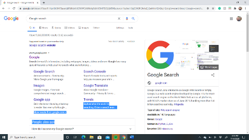
How many did you count? Seven? And the majority of those are the damn Google logo, right?
Think about that. Their page doesn’t have to struggle like a 1985 HVAC unit during a 100-degree heatwave. It’s plain, it’s simple, it’s clean, and more than anything, it’s fast.
And if you think Google doesn’t reward speed and simplicity:
“No matter what, faster is better and less is more.” – Google
But what about ease?
— — — — — —
Ease
When I asked Jon Gicewicz of J.E.G DESIGN INC. why the trend of solid frames of white space is growing exponentially within the world of web design, his response:
“Every design needs to be mobile responsive. A lot of the ‘flashy’ design elements are normally hidden from mobile anyway. Solid frames of white space provide a clean feeling, it’s easier on the eyes, it loads faster, and Google loves it!”
In other words, the open space around images helps the user determine what and what not to press. Instead of accidentally clicking on graphics that seemingly come out of nowhere – the white space highlights exactly what you want the user to see. All the while, supplying a much more pleasurable experience for the end-user. Why?
Because, no matter how much we claim we enjoy the complexity of life – we appreciate and approve of simplicity.
Think of that the next time you scream “customer representative” when calling your internet provider.
Think of that the next time you order a pizza instead of making rosemary garlic chicken with gluten-free pomegranate stuffing.
And think of that the next time you visit a website and can clearly decipher everything on your 5.6-inch screen.
— — — — — —
After some deep diving into NASA’s ill-fated, multiple-million dollar attempt to create space ink with American tax dollars, I stumbled across something – it turns out this is an urban legend.
But, to me, it is more like a fable that teaches a lesson all of us should learn:
- Simple is effective.
- Simple is elegant.
- Simple is successful.
And more than anything, just because it is simple, it doesn’t make it any less beautiful. It doesn’t make it any less spectacular.
And it doesn’t make it any less yours.
For more information and for a free estimate for your own graphic or web design, contact Jon Gicewicz at J.E.G. DESIGN INC. today!
Written by Keith Hannigan
&
Edited by Katrina Hannigan
Keith & Katrina are the owners of S.B.I. Content Creation LLC. For more information about the type of content S.B.I. Content Creation LLC specializes in, contact them today for your free estimate!
~
This content is the property of JEG DESIGN INC For more information about JEG, follow them on Twitter and be sure to like their Facebook page.