
Your brand is far more than your logo. In simple terms, your brand is how your business communicates with its customers and potential customers. That means everything from the name you choose to how you follow up after a sale.
A brand is a logo, and a logo is a brand, right?
Not entirely.
Your brand is far more than your logo. In simple terms, your brand is how your business communicates with its customers and potential customers. That means everything from the name you choose to how you follow up after a sale.
And the logo is a vital part of that.
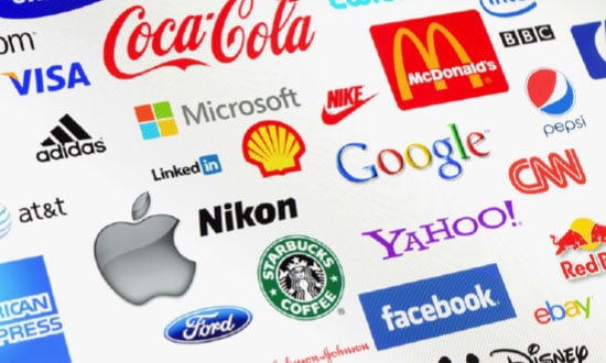
Though it isn’t the be-all and end-all of your brand, your logo can do a lot to put your brand on the map, so to speak. It’s the foremost visual representation of your company, and you should get a lot of mileage out of it.
But how can your logo really make your brand stand out?
Let’s take a look at three direct features of effective logo design, which can help to make or break a brand.
Dynamic Color Choice
This may be a new though to you unless you’ve been studying logo design for a while, but the colors that you choose for your logo can actually make a big difference in how your logo is perceived. And not only that, it can motivate your customers to seek your company out.
How?
Well, we aren’t just talking about avoid colors that are just plain ugly, or that aren’t commonly liked.
No, the psychology of color goes deeper than personal feelings — though it does take into account the common likes and dislikes of certain demographics.
Color influences our moods, motivations, and behaviors. Color can be used to impel someone into action (red is a very motivating color), to build trust (blue, often used for financial institutions for this reason), or to communicate warmth and friendliness (orange and yellow).
In terms of logo color success, top brands use one or two colors in their logo, and blue, red, and black or grayscale are by far the most common colors of choice.
The best color for an effective logo is on your market and your audience. Taking time to research the psychology of color and the impact it can have on your logo’s ability to amplify your brand is definitely worth it.
Unique Elements
It’s pretty easy to put a logo together, right? Just slap a piece of clip art on a square background, type in the name of your company, and you’re good to go.
Unfortunately, it isn’t anywhere near that simple.
Also unfortunately, it isn’t uncommon to find logos which were evidently designed by people who think that it is.
So when you’re designing, or redesigning, your own company logo, don’t be afraid to think outside the box — and do be afraid to just imitate whatever is around you. Generic logos don’t do your brand any favors.
If you want to use a traditional shape, that’s fine — hearts, stars, triangles, etc., are all classic shapes for inclusion in logos.
But do try to make it your own! Whether that means changing the colors up, using fill patterns, or opting for a hand-drawn look, make your logo stand out.
Your logo should never be easily mistaken for that of another company. With a generic logo comes a great loss of branding opportunities.
To make sure your logo really exemplifies your brand, make sure it stands out from the pack. This includes all elements within the logo, and how they relate to each other: graphics, overall shape, color choice, font choice, spacing, use of white space.
On Message
One final aspect of logo design that can really help to amplify your brand is making sure that your logo is on message.
To do this, of course, you must first know what your brand’s message is. Message is an integral part of a brand. It means what you do, how you present yourself to your public, and what your personality is.
How do you encapsulate all of that in a tiny logo?
Every element in graphic design carries a “tone” or a personality of its own. Sometimes, it’s true, that personality is “generic.” And sometimes the personalities of individual elements just clash wildly with each other.
For your logo to be on message, ensure that each element of your logo works toward the same goal.
As an example, assume that your company offers in home help to independent seniors who need assistance. Your company’s message would be one of warmth, friendliness, and trustworthiness. A cold, black and white logo would probably not convey that tone; a logo with warm colors, appropriate graphics, and easy to read type would fit much better.
Your logo is a fantastic chance to showcase your brand’s personality.
Guest Blog Post Author
Alicia Rother is a freelance content strategist who works with small businesses and startups to boost their brand reach through creative content design and write-ups. You can connect with her here.